UX writing is an important and fashionable sub-discipline in the world of content strategy. I remember when we called it “microcopy” and relegated it to the realm of forms and error messages. Marginalizing the importance of copy in a digital product can hurt the experience and damage the bottom line. With so much at stake, I wanted to sharpen my own UX writing skills to make sure I could move from strategy to execution with confidence.
I started by revisiting two books that I had already read, “Writing Is Designing” by Metts and Welfie, and “Strategic Writing for UX” by Podmajersky. The books got me thinking about who is qualified to call themself a UX writer. Most content strategists come from library science or information architecture backgrounds. Others are copywriters or journalists who made career transitions.
Regardless of background, UX writing is a learnable skill that requires a combination of understanding your audience, divining the purpose of an interface, and capturing the brand’s voice and tone at the time of the interaction. Essentially, it takes a knack for conveying meaning and humanity in tight quarters – to be succinct yet instructive. It’s not easy.
Continuing my exploration, I reviewed a few UX writing websites and even took a stab at tightening up a site’s copy. See below:
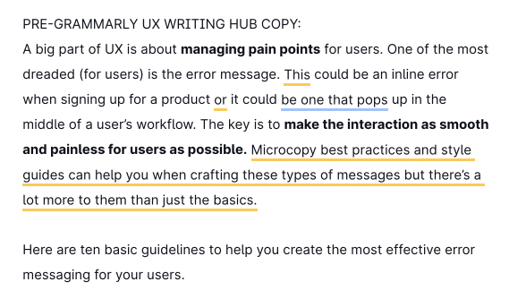
Original UX Writing Paragraph
The above paragraph is from a helpful site on UX writing about error messaging guidelines. The writer didn’t run it through Grammarly or another automated writing feedback tool. It’s still an effective introduction.
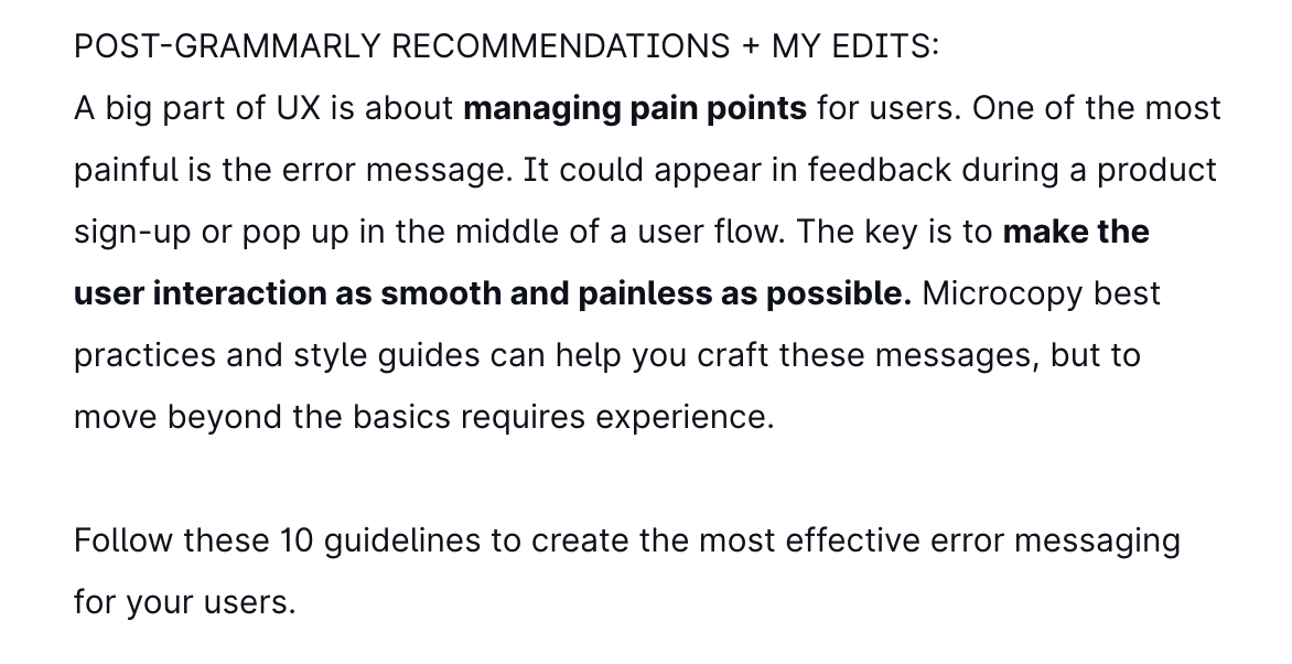
UX Writing Rewritten with Grammarly + Me
But it could be tighter. After running the paragraph through Grammarly, I applied minor edits to the copy. In one instance, I ignored Grammarly’s feedback and opted to use AP Style by writing the number “10” instead of “ten”.
I then took the 15-day UX Writing Challenge to apply my learnings and personal writing style (but not too much style, as good UX writing often needs you to check your ego at the door, unlike this blog where I can indulge in longwinded sentences like this one).
My copy throughout the Writing Challenge is especially terse because I counted characters with spaces included, which makes effective expression more challenging but ensures that the words actually fit within the constraints and have a better shot at a smooth translation without requiring a flexible height in the design, which can lead to odd alignments or line breaks.
I ran each response through Grammarly. At some point, I expect Grammarly to offer an AI-based UX writing package that will suggest copy based on an existing design or user flow. That would be a smart use of AI. Until then, we’ve got a chance to carve out careers in a craft we love.
The 15-day UX Writing Challenge
Day 1
Scenario: A traveler is in an airport waiting for the last leg of a flight home when their flight gets abruptly canceled due to bad weather.
Challenge: Write a message from the airline app notifying them of the cancellation and what they need to do next.
Headline: 45 characters (with spaces)
Body: 175 characters max (with spaces)
Button: 25 characters max (with spaces)
Headline:
Your Flight Is Canceled Due to Bad Weather (43)
Body:
Your flight has been canceled. To book the next flight free of charge, visit our customer representatives at the gate or use our app. We apologize for the inconvenience. (171)
CTA:
Book the Next Flight (21)
Day 2
Scenario: A user is a working parent, and a big sports fan, in the middle of their favorite sports season who can no longer attend games.
Challenge: Write a promotional screen for an app that lets a user choose teams, sends game reminders, real-time score updates, and highlight videos.
Headline: 40 characters max
Body: 175 characters max
Button: 25 characters max
Headline:
Your Favorite Team at Your Fingertips (38)
Body:
Never miss a moment of the action. Feel like you’re at the stadium with real-time updates and video highlights of the big plays. Long lines and crowded seating not included. (174)
CTA:
Select Your Team to Start (25)
Day 3
Scenario: The user entered the wrong email address to sign in to their account.
Challenge: Tell the user to enter the right email.
Micro-copy: 40 characters max
Microcopy:
Email address is incorrect. Try again. (38)
Day 4
Scenario: A user is in their favorite supermarket. They open the supermarket’s app on their phone to see what’s on sale and are greeted by a promotion.
Challenge: Write a promotional home screen for a subscription service that delivers groceries to the user once a month for a flat fee.
Headline: 45 characters max
Body: 175 characters max
Button(s): 25 characters max
Headline:
Skip the Lines, Try Home Delivery (34)
Body:
Get groceries delivered to your doorstep. Same great selection, same great prices, all new convenience. Subscribe today for once-a-month deliveries. Freshness guaranteed. (170)
CTA 1/2:
Sign Up for Delivery (21)
Continue to sales (17)
Day 5
Scenario: The user works in graphic design. While critiquing a design in a mobile app, their phone abruptly turns off. When they restart the phone, they reopen the app.
Challenge: Write a message that the user will read immediately upon opening the app. What do they need to know? What steps (if any) do they need to take to recover their content? What if they can’t recover the content?
Headline: 40 characters max
Body: 140 characters max
Button(s): 20 characters max
Headline:
The App Unexpectedly Closed Last Time (35)
Body:
Don’t worry, we automatically saved your progress. If it looks like something is missing, please contact support for additional help. (134)
CTA:
View Saved Work (15)
Day 6
Scenario: It’s Monday. A user has just gotten into their car to drive to work. They plug their phone into the car and start driving.
Challenge: How would you let the user know there’s a fire happening in a nearby town that is causing road closures? The effect on their commute is unknown, but there is a definite danger if the fire gets closer. How do you communicate this to them? When? Write it.
Headline: 30 characters max
Body: 45 characters max
Headline:
Alert! Fire Emergency Nearby (29)
Body / no app:
Try 1610 AM for safe routes and closures (40)
Body / with map app installed:
Find safe routes and road closure information (45)
Day 7
Scenario: A sports fan is at a wedding while their favorite team is playing against their arch-rivals. Their team scores.
Challenge: How would you, quickly, let the sports fan know about the latest play, the current score, and the key players? Write it.
Headline: 30 characters max
Body: 45 characters max
Headline:
Score Update: Cubs Lead 1-0 (27)
Body:
Rizzo solo HR gives Cubs 1st-inning lead (40)
Day 8
Scenario: The user is a casual music fan and (on occasion) goes to live concerts. They have a music player app on their phone.
Challenge: Tell the user that one of their favorite bands is playing live in their town. How would you compel them to want to go?
Headline: 30 characters max
Body: 45 characters max
Button: 25 characters
Headline:
RTJ Performs Live in The Chi (29)
Body:
Rap duo visits Cadillac Palace on Nov. 2 (41)
CTA:
Buy Tickets Now (16)
Day 9
Scenario: The user is trying to rent a car using an application but the credit card on file has expired.
Challenge: Write them an error message so that they can correct the problem.
Headline: 30 characters
Body: 45 characters
Headline:
Your credit card has expired (29)
Body:
Update the card’s expiration date to continue (45)
Day 10
Scenario: The user is trying to view a website to help them buy a car. But, the content can’t load without the user’s location. They need to enter their ZIP code and first name.
Challenge: Ask them where they live and who they are without sounding like you’re unnecessarily mining their data.
Headline: 25 characters
Body: 45 characters
Button: 15 characters
Headline:
Find cars closer to you (23)
Body:
Enter your zip code and first name to begin. (44)
CTA:
Start searching (15)
Day 11
Scenario: An elderly user is doing a Google search to find an easy way to buy contact lenses online.
Challenge: Write a title and meta description for a website that sells subscription contact lenses delivered to a user every 30 days—convince them to try it.
Title: 60 characters max
Meta Description: 160 characters max
Title: Buy Contact Lenses Online – Free Delivery with Subscription (60)
Meta Description: Ordering affordable contacts online is easy. Get a pair of prescription lenses delivered every 30 days with subscription. Best brands. All major vision plans. (159)
Day 12
Scenario: A user is creating an account. When they come to the step where they are asked to enter their name, they get an error message. A fraud detection software thinks their name is fake—but it’s wrong 5% of the time.
Challenge: Write an error message that prompts them to fix the error without shaming them for having a fake-sounding name.
Error Message: 45 characters max
Error message: Re-enter your name to confirm it is correct. (44)
Day 13
Scenario: A short-haul truck driver has a phone app that monitors his route, schedule, fuel and deliveries.
He has six more deliveries before stopping for fuel and lunch. Due to unexpected traffic, he’s behind schedule.
He can choose to stay on his planned route for a few more stops, but risk running low on fuel and missing lunch, or he can get fuel and lunch now and finish the deliveries later.
Challenge: Write a push notification alerting him of this dilemma and options.
Headline: 30 characters max
Body: 45 characters max
Button(s): 25 characters max
Headline: You are behind schedule (24)
Body: Adjust your route to re-fuel and eat (40)
Primary Button: Try new route (13)
Secondary Button: Stay on current route (22)
Day 14
Scenario: a user is shopping using a price comparison app that boasts “real-time” pricing on items. As they are checking the price of an item, something goes wrong. The problem is unknown.
Challenge: write a message that informs the user that they cannot access the app right now. You cannot specify “why” the app doesn’t work, you also want them to continue using the app.
Headline: 30 characters max
Body: 120 characters max
Button(s): 15 characters max
Headline: Sorry, the price isn’t right (28)
Body: We’ll notify you once real-time pricing is working. For now, you can view products, but won’t be able to purchase them. (119)
Button(s): Keep shopping (14)
Day 15
Challenge 3: Write a multi-screen onboarding experience for a banking app that automatically pays a user’s bills every month—as long as they set it up correctly.
Character constraints per screen (all challenges):
Headline: 45 characters
Body: 100 characters
Button: 25 characters
Time limit: 1 hour
Once you are done with your chosen challenge, include a short, one-paragraph explanation of your design decisions. Defend and rationalize your work.
SCREEN 1 – Introduction
Headline: Pay your monthly bills, automatically (37)
Body: Paying your bills is easy with BigBankCo app. Connect your accounts and we’ll take care of the rest. (100)
Button: See how it works (16)
SCREEN 2 – Demonstration
Headline: Three easy steps to automate bill pay (38)
Body: 1. Select the companies you want to pay. 2. Log in to each account to connect. 3. Verify connection. (100)
Button: Let’s get started (16)
SCREEN 3 – Ready to start
Headline: No more late payment headaches
Body: Save time, save on stamps, and avoid late fees. Ready to start?
Button: Add my accounts now (20)
Rationale: Since this represents the onboarding portion of the app, I wanted to keep the introduction screen brief but informative. On the second screen, I wanted to show how easy the process of setting up automatic bill payment will be. On the third screen, I wanted to reinforce the benefits and encourage users to start setting up automatic bill pay.
If the user is not interested in proceeding further at any point, they should be able to “X” out of the onboarding tour and use the non-automated features of the app. If the app’s only function is to automate bill payment, then this onboarding would integrate seamlessly with the functionality.
I may eventually design these solutions in Figma to pressure-test if the words and visuals work together. I’d also consider writing multiple options and testing them with the internal team or customers.
Feel free to critique my responses by emailing ethan@tapcool.com.