MyEmerson Registration
Conversion and form-design case study
The Automation Solutions business group at Emerson wanted to boost registration rates for its new authenticated engineering hub.
As lead experience designer and information architect on the project, I participated in competitive analysis and content organization exercises.
My role(s)
Experience Design Lead and Information Architect
My responsibilities
Lead competitive analysis and heuristic evaluation of registration form. Identify interaction and content enhancements to streamline the registration process and achieved desired KPIs of improved registration rates and site satisfaction scores.
The team
Interaction designer, technology, account
Competitive Analysis
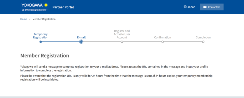
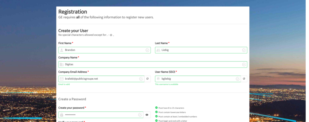
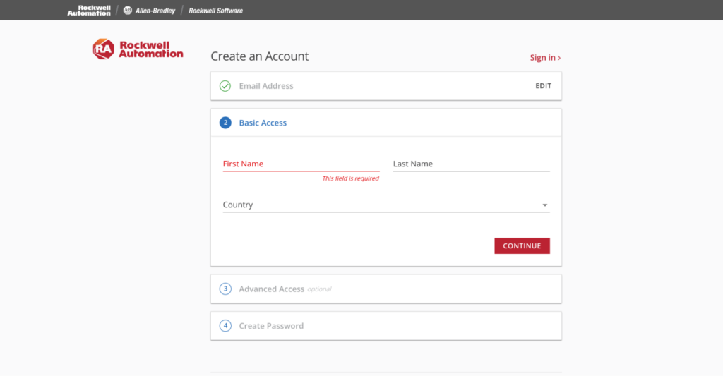
We identified a list of competitors who had similar authenticated experiences and followed a standard set of heuristics against which we could evaluate competitors’ forms to establish a baseline of usability best practices for the new registration experience.
Competitors Reviewed
- ABB
- Eaton
- Endress+Hauser
- Festo
- GE Power
- Rockwell Automation
- Schneider Electric
- Siemens
- Yokogawa
Heuristics Evaluated Against
- Visibility of system status
- Mental model
- User control and freedom
- Consistency
- Error prevention
- Error recognition & recovery
- Recognition vs. recall
- Flexibiity / efficiency of use
- Minimalism
I identified three UX patterns from the competitive set that Emerson could leverage to create a better registration experience that would decrease time and effort spent completing a registration and achieve the target metrics for conversion:
- Inline validation – just-in-time feedback that lets a user know they’ve successfully inputted information
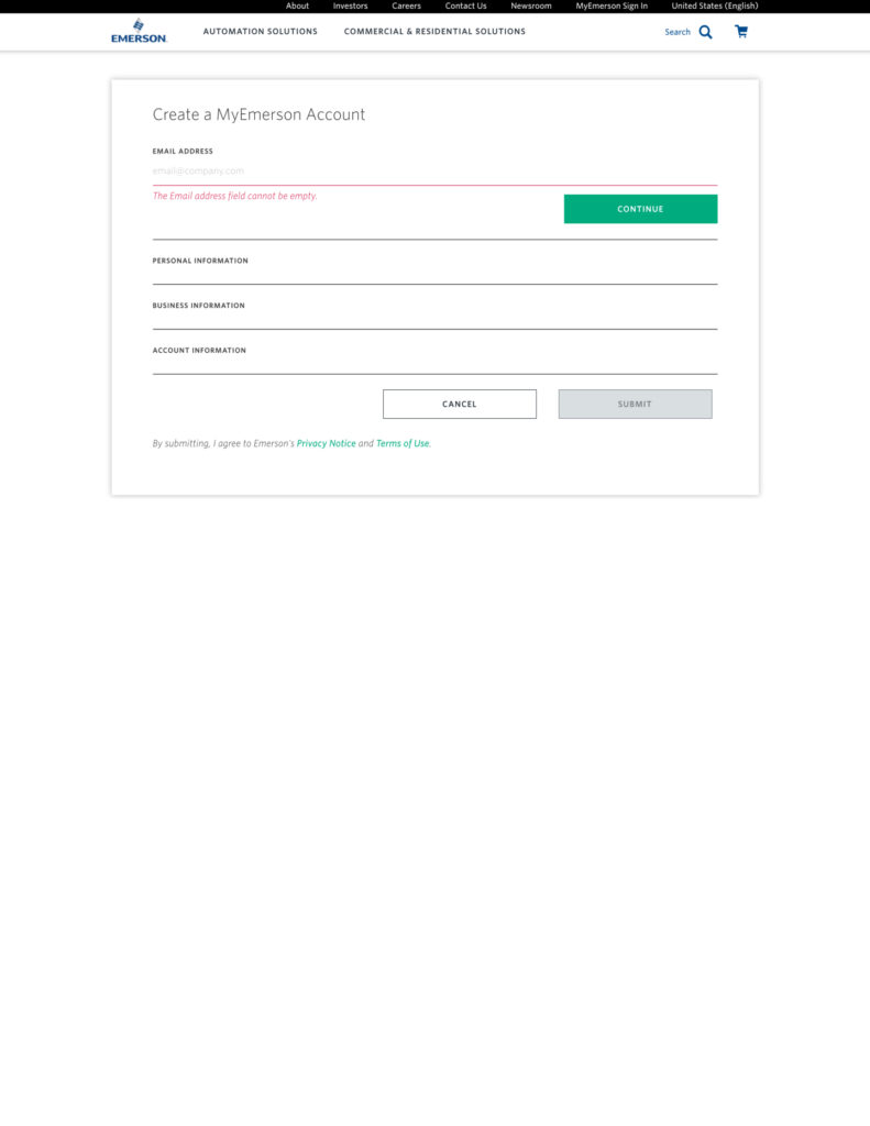
- Progressive disclosure – chunking up longer form experiences into sections that confirm a like-minded groups of form fields have been successfully inputted
- Smart microcopy and dynamic hint text – supporting copy that provides real-time feedback and hint text to confirm a user is on the right track
Content Organization
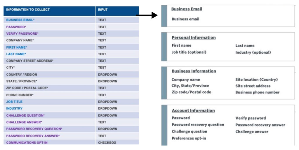
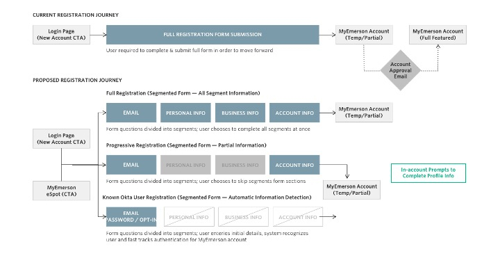
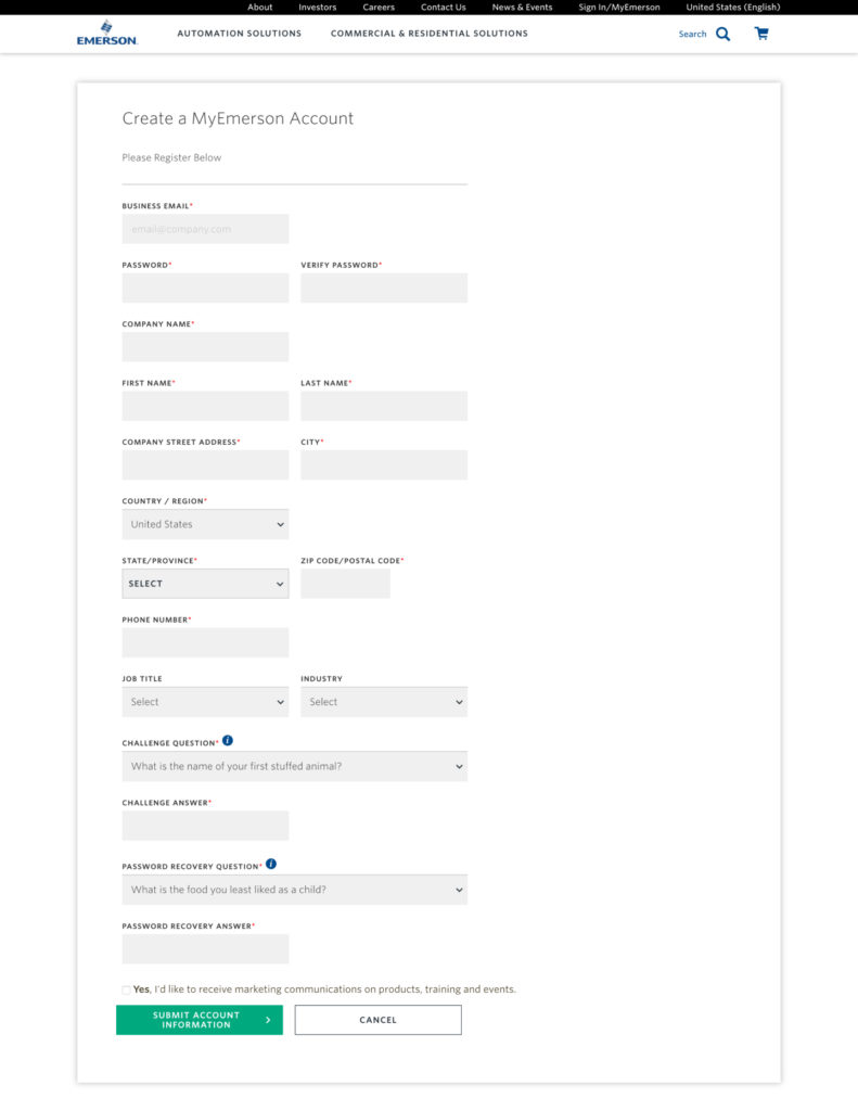
The existing registration form had 19 required fields. We watched several VWO eye-tracking recordings of users completing the form and it appeared that they were, in some instances, jumping around to different spots of the form to complete it. We initially recommended substantially trimming down the list of inputs to get people more quickly into the system, but technical constraints required all fields to be filled out.
Based on this requirement and some of those user observations, I began to organize the inputs into more logical groupings than the long laundry list in which they had originally been placed. The four sections were: business email, personal information, business information, and account information.
Use Journey Recommendations
In addition to re-organizing the inputs, we recommended that existing single sign-on functionality be used to automatically recognize existing users’ email addresses from the Emerson software ecosystem.
For unknown users, they could either complete the entire form or use just their email address to log into a sandbox environment to help convince them to complete the entire registration process.
Key Challenges
Business Requirements
The requirements to keep all 19 fields meant we needed to set aside typical best practices and find the next best solution to make registration easier.
Single Sign-on Integrations
The integration for single sign-on hadn’t been completed yet, which forced us to abandon an approach that would have made registration a breeze for existing customers.
Fit and Finish
Due to the business group’s budget constraints, we were unable to provide a detailed prototype that would have illustrated exactly how the experience should behave. Instead, our static recommendations were interpreted by the development team, which is always risky. Still, it did move the dial.
Project Outcomes & Takeaways
At the beginning of the project, the form looked daunting and had high drop-off rates. By the end, despite our concerns about the fit and finish of the experience, the form included a number of enhancements:
- Inputs rearranged into logical content groups
- Progressive disclosure to address the formidable list of fields
- Smarter inline validation with all input fields tagged and trackable
- A disabled “Submit” button to prevent premature submissions, which would also generate more accurate success-rate metrics in Google Analytics
