Jones Lang LaSalle
Content marketing hub and website redesign case study
A prestigious commercial real estate company wanted to unify its style and approach to marketing thought leadership content.
As lead experience designer and content strategist on the project, I helped shape a vision for an intelligent, centralized content framework that would surface relevant articles and research papers based on a user’s location and interests.
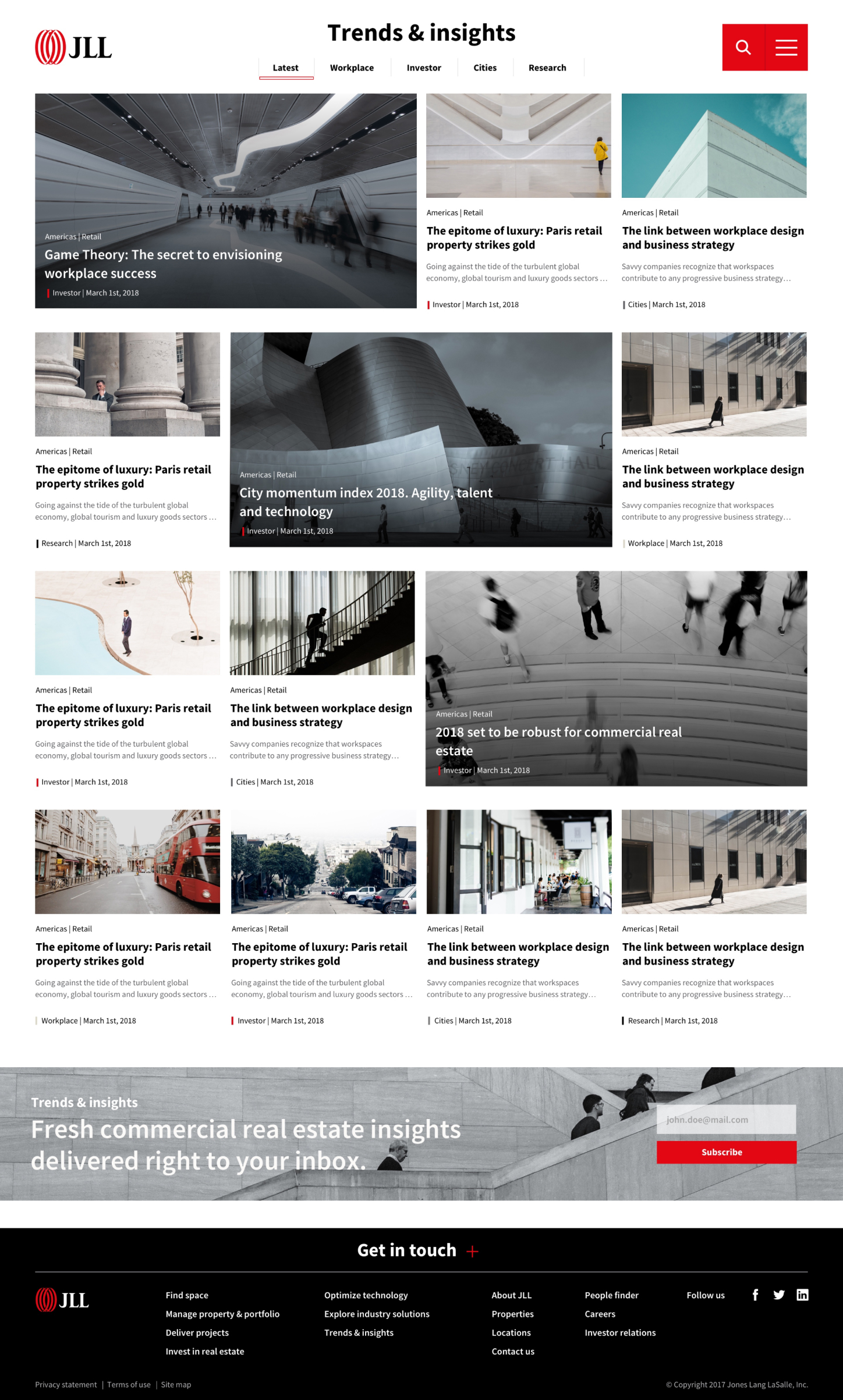
The new Trends & Insights content hub launched in late 2018. The entire website also got a facelift with a new library of hyper-stylized design components that met the client’s mantra to “go bold.”
My role(s)
Experience Design Lead and Content Strategist
My responsibilities
Conduct content inventory and audit. Present results of the audit and channel strategy to stakeholders. Ensure strategy’s implementation during the design phase. Create authoring and design specification documents, including a content guide.
The team
SEO analysts, data scientists, visual designers, content strategists, information architects
Formulating a Content Strategy
Inventory and Audit
To start the project, I ran a Screaming Frog crawl of the JLL website to find outbound links to all existing blog properties. The crawl revealed five primary blogs and many others that were limping along with little traffic and off-brand styling.
I partnered with a data scientist and SEO analyst to better understand the blogs’ traffic and the content that interested commercial real estate investors, occupiers, and brokers. The data suggested that consolidating the blogs would boost JLL’s domain authority and increase traffic that could be measured in one consolidated view.
The audit revealed four primary categories of interest: The future of the workplace and technology, investing opportunities, the importance of local/city markets, and data-driven trends.
Opportunity
To create a more coherent editorial presence, we recommended three key pillars for a new content strategy:
Integrated Publishing Platform: Achieve editorial and cost efficiencies through a common technology and unified publishing workflows for all JLL authors. Organize articles topically on the site and not with standalone blogs that diluted SEO value.
Shared Editorial Calendar & Guidelines: Break down silos and prevent cannibalization with a shared view of publishing schedules and targeted keywords.
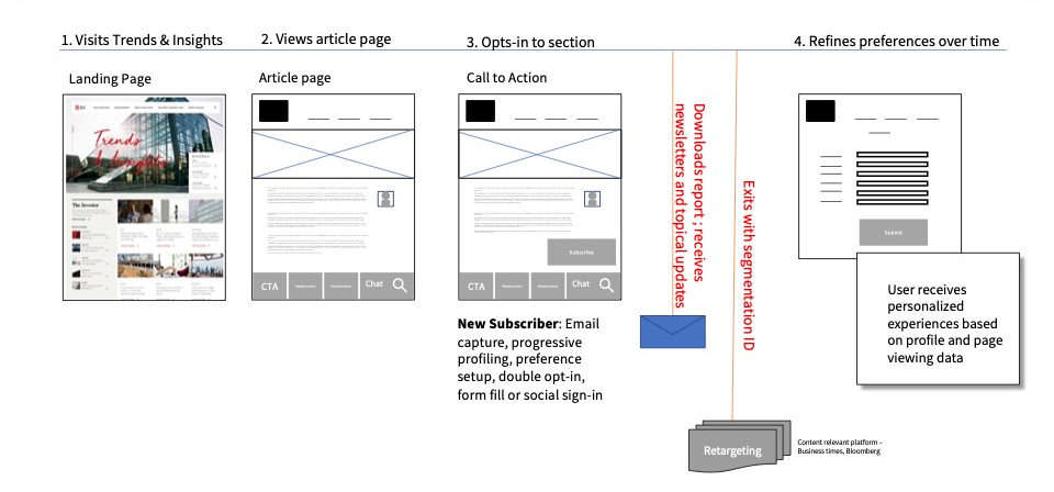
Personalized Content Experiences: Allow customers to express preferences in order to serve personalized blog content through website and email communications. For example, an investor in Chicago would see global investment trend content and localized content around her topical, industry, and property preferences.

Less Content, More Strategy
72%↓
Reduce core website pages and focus on optimizing top-ranking pages
48%↓
Reduce dated research by changing archive rules from 36 to 18 months
many→1
Consolidate blogs to streamline coordination and messaging alignment
Content Design Specs
To create a flexible design system for the section, I partnered with a visual designer to define slots within the article teasers for all the metadata identified in the content strategy.
We designed a grid system that would allow authors to highlight content in a variety of ways with featured and support tiles. On desktop, this meant that content could be organized in five different ways:
・50-50 featured splits
・50-25-25 featured left
・25-50-25 featured center
・25-25-50 featured right
・25 x 4 standard default grid
The proposed grid logic gave content authors the flexibility to localize their Trends & Insights section. But no matter the locale, users would encounter a consistent, branded experience.
Challenges
The Ownership Blues
The commercial real estate industry is very competitive. Owners of the existing off-platform blogs initially disliked the idea of coordinating content on a single, centralized platform. It took time to convince them of the strategy’s value.
Image Guidelines
We proposed ambitious image guidelines for the website, which required a great deal of pre-processing to create interesting angles and imagery that spanned across multiple divs. This “bold” approach won stakeholder buy-in but proved difficult to implement.

Project Outcomes & Takeaways
It took the client a few years to consolidate all the blogs onto the AEM platform in the new Trends & Insights section. But it eventually happened, and of all the design elements we provided, the content hub remains one of the enduring sections and styles from the website redesign project.
Creating a centralized publishing platform where editors and writers can understand holistically what’s being created – and plan out how those pieces of content work together to cross-sell and cross-promote opportunities – remains a powerful tool in the content strategist’s toolkit, and represented a successful outcome to the project.


