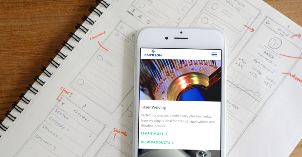
Emerson Electric
Digital transformation and website redesign case study
Emerson Electric, a Fortune 500 engineering company, set out on a transformational journey to streamline its fractured website presence onto one enterprise platform. Making the industrial company easier to do business with online became our rallying cry.
I worked closely with internal teams and external stakeholders to understand the needs of industrial executives, career-seekers, DIY’ers, and engineers.
My role(s)
Experience Design Lead and Content Strategist
My responsibilities
Lead discovery and sprint planning. Present vision to stakeholders. Collaborate with the internal team to ensure the realization of the vision in the written and visual representations of the experience. Define content strategy, create and manage content guide, content matrix, and copy decks.
The team
Interaction designers, UX researchers, visual designers, copywriters, content strategists, account, project management
UX Discovery
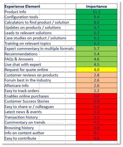
My team and I went to Denver, Colorado for Emerson Exchange, an annual users’ conference where Emerson highlights new products and technology roadmaps. We interviewed business unit leaders, sales reps, distributors, and customers about what they wanted to see in the new digital experience. We conducted card-sorting and “spend a dollar” exercises to understand how they might organize a complex set of products and prioritize features.
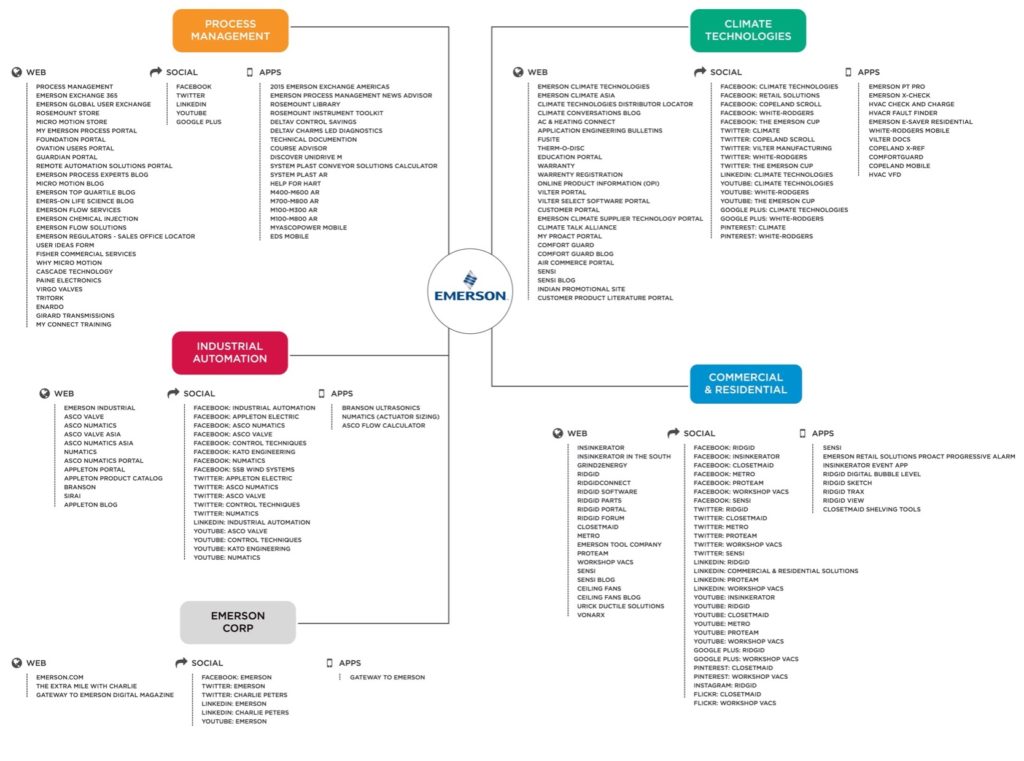
In addition to what we learned at Emerson Exchange, I also conducted an in-depth content inventory and audit of the Emerson ecosystem and crafted a survey/discussion guide to send to other business units.
Opportunity Assessment
Based on these inputs and observations, we started to develop a hypothesis for transforming the company’s digital experience.
As part of the hypothesis, we noted that engineers wanted to move beyond the brand-centric focus of the organization. They wanted multiple ways to find products by category, industry, application, solution, and brand.
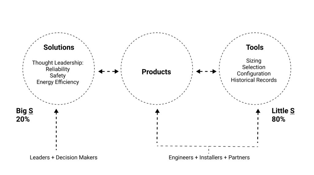
To achieve that sort of findability and flexibility, we recommended a new product taxonomy and structured content for a product catalog and product detail pages. Without this foundational content, their thought leadership content would fall flat and lack connective tissue. The content strategy diagram below expressed a recommended mindset.
North Star Prototype
Creating a North Star prototype is an integral part of our design process. It highlights key pages of the experience and presents a visual guidepost for us to reference and partner with the client to refine. Our initial vision included:
🔥 Modern product detail and catalog pages flexible enough to work across a diverse product lineup
🔥 In-depth and highly visual industry pages to showcase how multiple brands’ products served a particular industry, and when positioned together, could reflect the power of One Emerson
🔥 Brand pages that could serve legacy customers who had established relationships with Emerson brands such as Rosemount, Micro Motion, Fisher, and ASCO
🔥 A home page featuring One Emerson solution stories supported with subtle micro-interactions and videos to bring to life the new value proposition
🔥 Contextual “contact us” widgets to help users wade through hundreds of brands and get support when and where needed
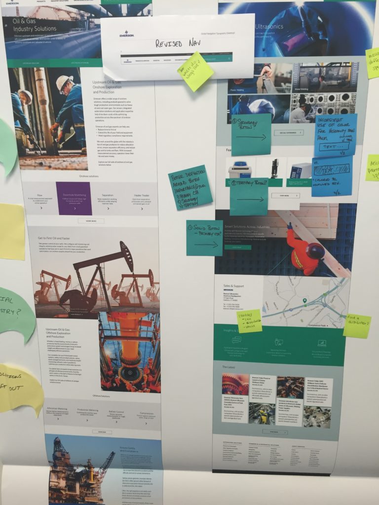
After presenting the prototype to senior leadership and getting buy-in on the vision, we held two additional workshops – one in Pittsburgh and another in St. Louis. We used the prototype as a “virtual piñata” during these workshops to shake out additional project requirements.
Design and Content Sprints
We aligned on requirements and roughed out sprint details during Sprint 0. I dedicated my focus of the first sprint to create drafts of the information architecture, content matrix, and navigation. I worked with the visual designers to establish a responsive grid, typography, a refined digital color palette, and a handoff process with Emerson’s development team.
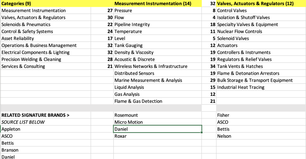
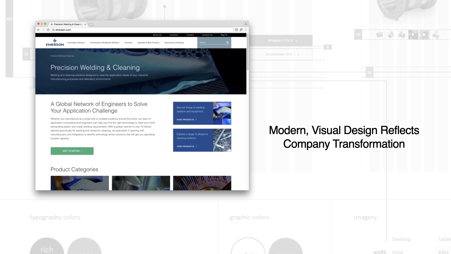
During the next five sprints, we designed and annotated comps across desktop, tablet, and mobile viewports, and chronicled more than 50 custom components in a content guide to help content authors build out the site. The guide contained the intended use of all components and layouts, image guidelines, calls to action, and writing and SEO best practices – all in one handy package.
To further support the production effort, I led a team that created copy decks that mapped to the new components and layouts. We authored top-level corporate pages and the Precision Welding & Cleaning section of the site within the new CoreMedia content management system.
UX Techniques Used in the Project
- User and stakeholder interviews
- Discussion guides
- Surveys
- Card sorting
- Tree testing
- Competitive anaysis
- Content inventory audit
- Personas
- Customer journey maps
- Hi-Fidelity Prototypes

Project Outcomes & Takeaways
The website won a 2017 Drum B2B Brave Award. The project allowed me to grow as a digital leader and presenter of ideas.
The bulk of the Emerson.com website design project spanned from 2015 to the end of 2016. Iterations continued into 2021 during maintenance sprints. I made it to Sprint 95 and, along the way, partnered with many talented engineers and user experience designers.
