Emerson Online Style Guide
Design systems operation evaluation and recommendation case study
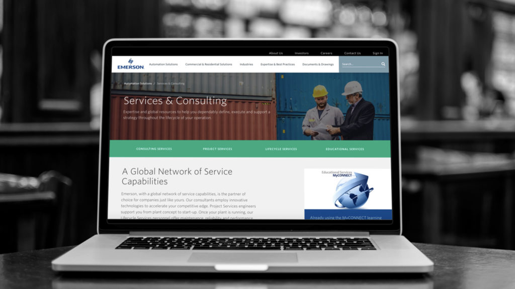
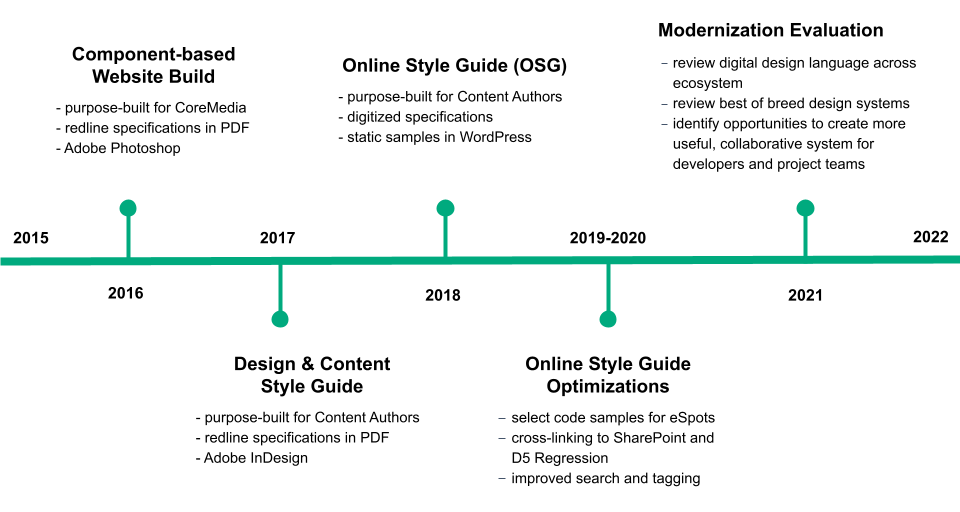
After launching the redesign of Emerson.com, we codified the web components and their intended usage into an online style guide. As time passed, we needed to evolve the experience to make it more useful and executable.
As the experience design lead, I embarked on an examination of best-of-breed design systems and the technologies that power them.
My role(s)
Experience design lead and researcher
My responsibilities
Learn about best-of-breed design systems. Define the current state of the design system ecosystem and identify gaps and opportunities. Present POV to the client.
The team
User experience designer, technologist, account
What Makes a Design System Modern?
We identified five major attributes of modern design systems that unlock value across an enterprise’s digital ecosystem:
- Style definition – the foundational particles of a system, including colors, typographic scale, iconography, grids, elevations, shadows, and spacing; many of these are expressed as design tokens
- Component and template definitions – the elements and building blocks of a system that can be assembled into a coherent experience to build a page or part of an application
- Interactive and responsive assets – the live, visual expression of those building blocks’ variable properties (i.e., variants) and how they behave across different viewports
- Executable code snippets and directions – the ability to view the code of the building blocks and instructions for accessing and executing the code across different platforms to ensure consistency within a brand’s digital ecosystem
- Downloadable resources and guidelines – the definition of intent for content authors and developers, with resources that can be re-purposed outside of the system

Current Design System Ecosystem
We analyzed the current design system as a baseline to identify gaps and areas of opportunity.
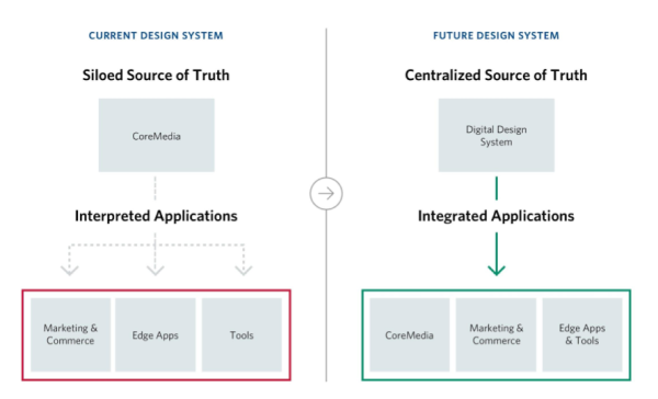
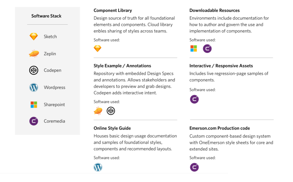
Many core pieces already existed, but were in different locations, which sometimes led to outdated or contradictory information. Over the years, we had built a library of components in Sketch that could be used to quicky build out a page. We used Zeplin and Codepen for annotations and to show interactive intent. Documentation lived in three separate locations: WordPress, SharePoint, and the CMS.
Recommendations for Change
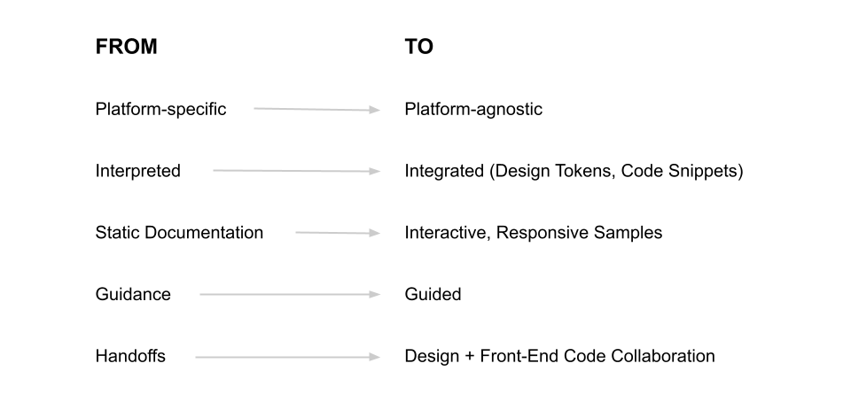
We identified five broad-based strategic areas for change, plus four specific opportunities that we could break down into projects depending on the direction that client wanted to go:
• define and convert our design particles into design tokens
• establish live, interactive code examples to preview components
• create reusable, functional code for developers
• consolidate resources and instructions to prevent out-of-date info
Tools for Change
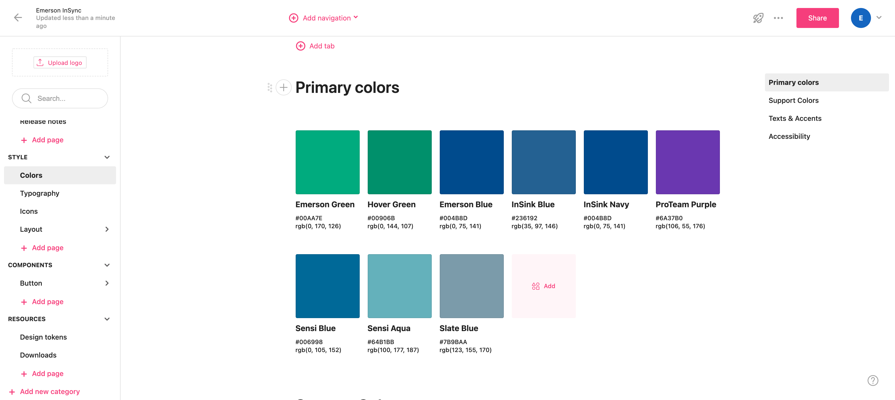
As part of the project, we evaluated several tools on the market that could help us achieve our identified opportunities. We also considered the ways in which we could extend the current toolset or integrate them with new options. Two tools particular tools showed promise: Storybook and ZeroHeight.
Key Challenges
Design Debt
Several of us who worked on envisioning and updating the original design system also worked on the evaluation. The attachment to the existing model and the work it would take to overhaul it may have biased our attitude about what needed to change. We worked through this reluctance and presented the best options regardless of the implications.
Stakeholder Understanding
We presented mostly to marketers who didn’t always understand the recommendations we were making or why. Why presented a few different times to explain what was wrong with the current system and created demonstrations for how these issues could be addressed in an enhanced design system.
Enterprise Buy-in
With different agendas and KPIs, getting all the different business units to understand the importance of a unified design system was a challenge. We showed them many examples of how their projects continued to reinvent the wheel with different outcomes. We emphasized the potential cost savings and the need for better brand consistency.
Project Outcomes & Takeaways
The deep dive into design systems got me excited about design operations as a practice and the possibilities it could unlock for quickly scaling code-ready projects.
We presented the client with three options for modernizing the existing design system, each evaluated against the following dimensions: level of effort to implement, ongoing maintenance effort, future flexibility, gaps addressed, single source of truth, and cost.
Before a decision was reached about the future direction of the design system, I decided to move on to different career opportunities. This project broadened my understanding of design systems and the technologies that power the best component-based design systems.
