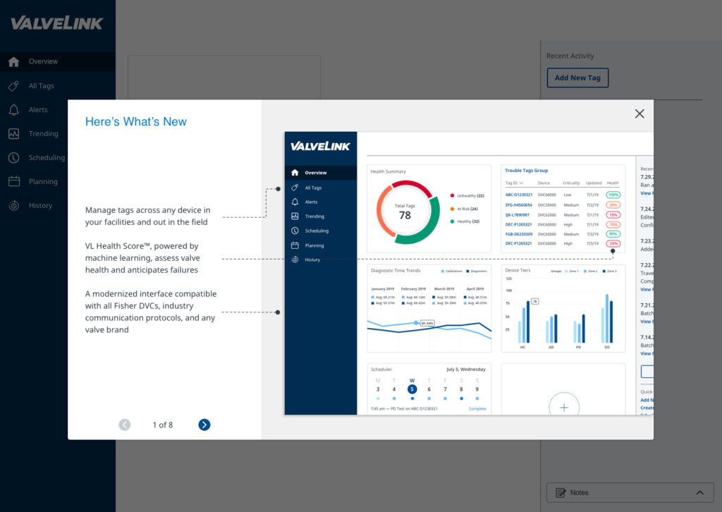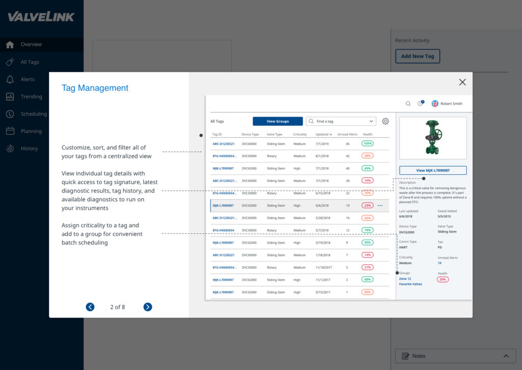
Fisher Valves wanted to revamp its connected valve software with a more intuitive interface and clearer paths to primary functions.
As lead experience designer and information architect on the project, I participated in contextual inquiry research and interviews with process engineers in Iowa, Montana, and Wisconsin.
Over the course of three design sprints, our small team crafted a development-ready vision for the next generation of software for the Industrial Internet of Things (IIoT).
My role(s)
Experience Design Lead and Information Architect
My responsibilities
Lead research and discussions with engineers. Collaborate with the internal team to conceive designs and define the user journey for the prototype. Blue sky thinking. Gamification elements. Annotate design handoffs. Write prototype copy and navigational elements.
The team
Interaction designers, UX researchers, visual designers, account, project management
Contextual Inquiry
Our discovery process began at the company’s headquarters in Marshalltown, Iowa, where their engineers and project lead demonstrated how the ValveLink software remotely connects to a controller on the physical valve to monitor a configurable set of conditions.
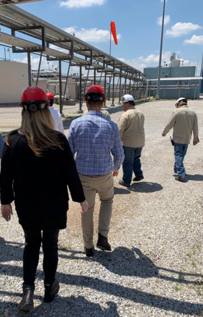
We then went on-site to process plants. In Billings, Montana we took an in-depth tour of a refinery plant and began to understand how noise levels, heat, and other conditions impacted engineers on a daily basis. Each of the three site visits revealed pain points and opportunities for the redesign.
Site insights
Iowa visit
In my mind, if you open up ValveLink you should come to a menu or some sort of system with buttons for recommended actions. Something intuitive.
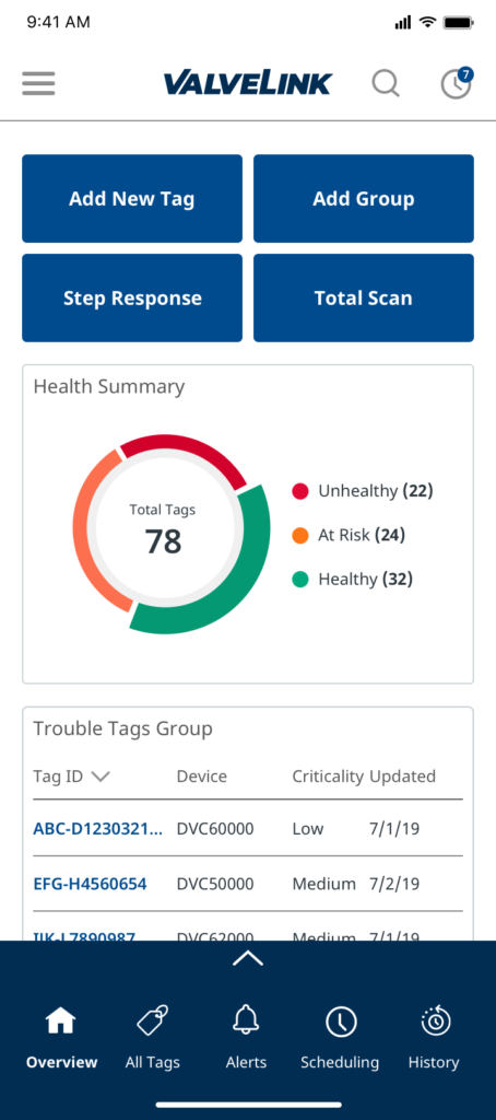
Impact: Mobile design included customizable top tasks buttons above the dashboard.
Wisconsin visit
ValveLink should allow for image upload for the tag, not just the task. And the ability to add notes would be great.
Impact: Tag details pages included upload options and notes section in the design.
Montana visit
We want a commercial, off-the-shelf tablet that we can wander around with and use different tools.
Impact: We added a consultation phase explaining how the designs could work as a progressive web app.
Stakeholder Workshop
The company’s engineers on the project team participated in a spirited workshop with us. Solving for slow and intermittent connectivity at the plant sites emerged as an important theme, and accounting for older versions of the valve controllers already in the field added a twist to the project.
We also co-crafted a vision statement at the workshop, which became our guiding light to design a “…modern, guided, time-saving experience that inspires confidence and empowers users to keep their valves running optimally.”
Sprint Planning and Early Concepting
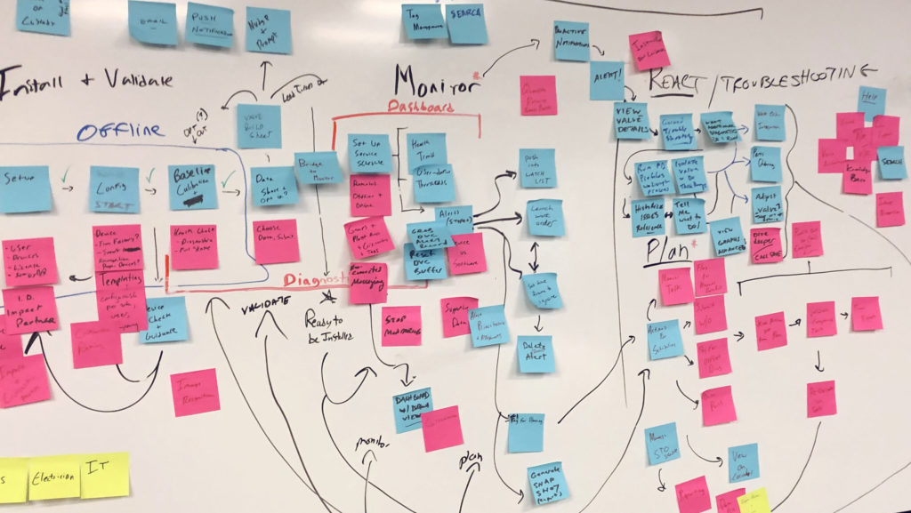
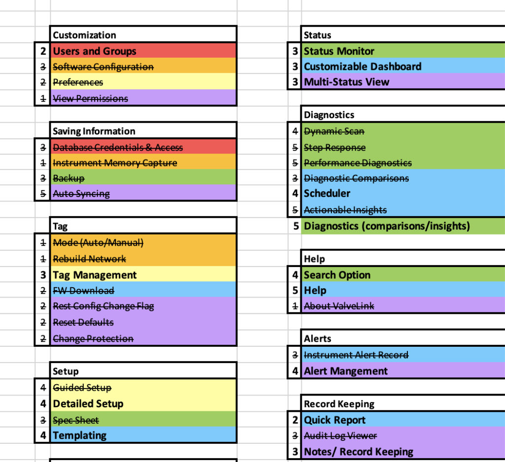
After our workshop and site visits, we created a document that summarized our key findings and proposed a user journey through the prototype we were going to build. Our client partners then reviewed the proposal and identified high-priority screens.
After aligning on the screens, we held several smaller working sessions to sketch as a group and align on the high-level structure of the software.
Design Sprints
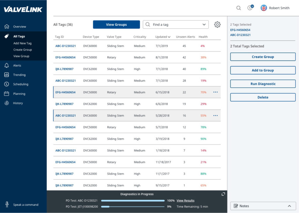
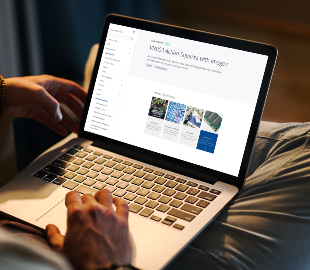
Because of project constraints, we prioritized which screens would benefit from high-fidelity treatments and which could remain as wireframes. I helped conceive the three-panel layout and terminology within the navigation, and how that experience would change when engineers were in the control rooms versus when they were in the field on their mobile devices working directly with the valves.
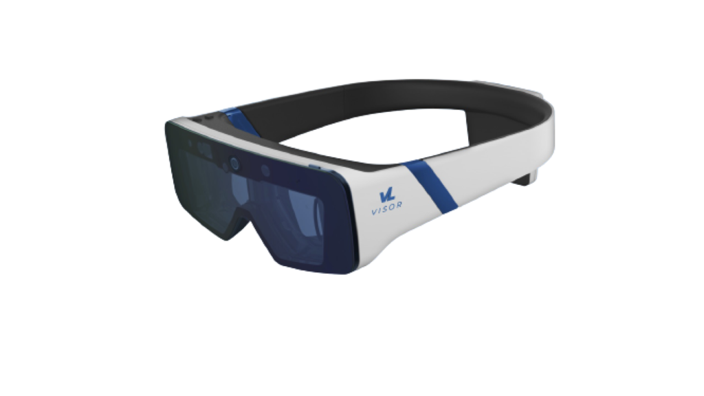
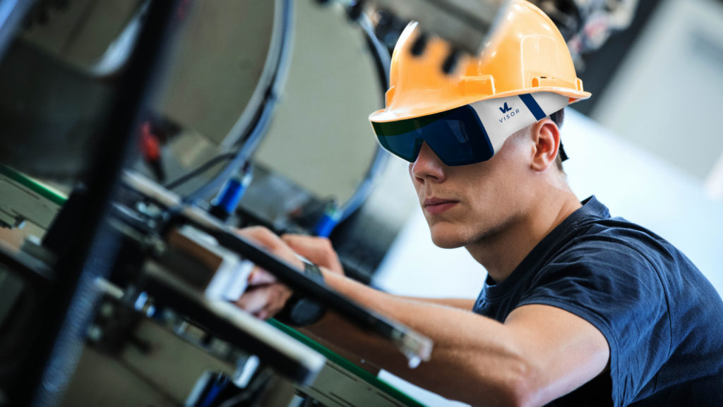
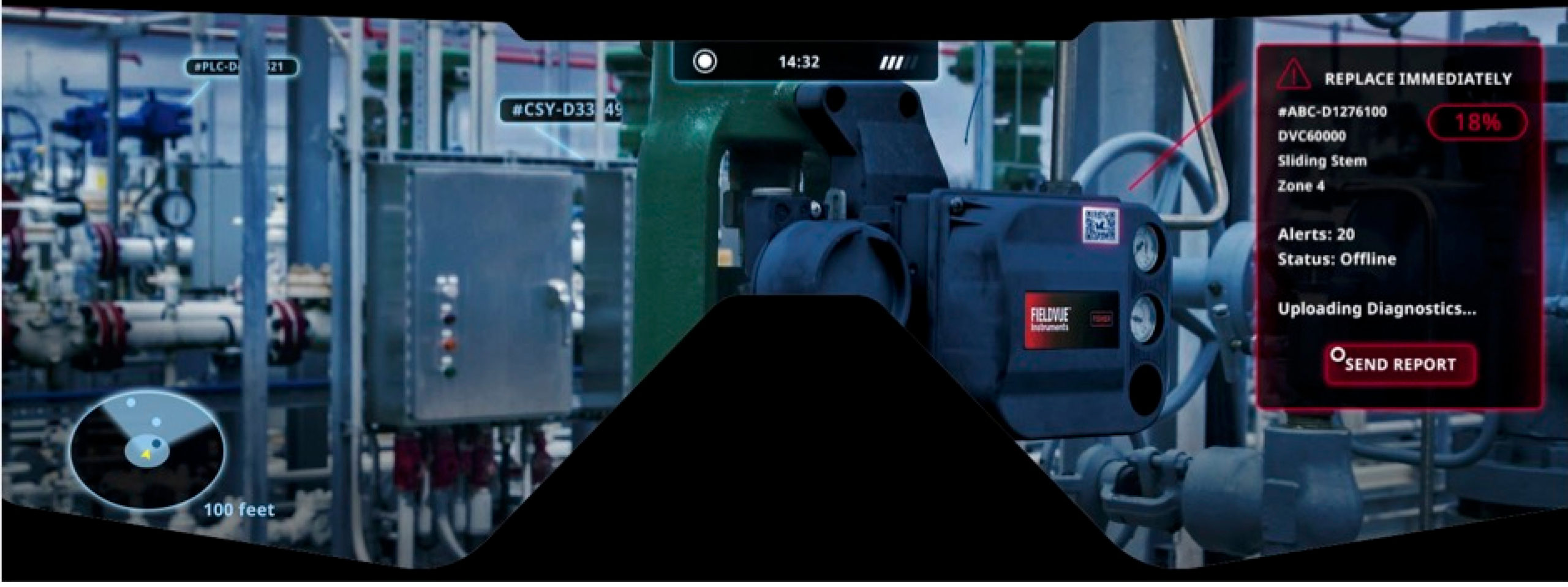
We also explored “blue sky” options such as AR visors for in-field diagnostics, subtle gamification elements, and voice-activated commands for power users in the control rooms.

Key Challenges
Complexity
The subject matter required great technical adeptness to understand how the controllers on the valves stored and passed data to the software, and how mesh networks with HART protocols transmitted the data. Our technology lead on the project played a key role in supporting the design team.
Staff
The tech lead left after our second sprint, which hamstrung some of our understanding. Luckily, the client helped us and answered even our dumbest questions, twice if necessary.
Duration
A project of this complexity required more than three sprints. Just as we were beginning to truly immerse ourselves in the project, it ended. We would have liked to test out our designs with the same engineers who we interviewed and observed.
Project Outcomes & Takeaways
This intensive six-month project helped sharpen my end-to-end user experience design thinking and skills. Through a combination of on-site observations and stakeholder workshops, I better understood the needs of process engineers who used the valve software at their job sites.
The final designs reflected updated branding, a modern interface, and a much more intuitive way to configure, manage, and service valves. The new software is slated for a 2022 release.
